Responsive Web Design
It used to be that web designers didn't really need to worry too much about how their websites looked on different sized screens, on different devices, or, to a certain extent, in different browsers. The web used to have a one-size-fits-all approach. However, that isn't really the case any more. In the current year, people might view the same website on a tiny touchscreen phone while other people view it on a giant 2560-by-1440 display. Designers are now forced to accept that, when they make a website, they can no longer make one website. Enter Responsive Web design.
What does "responsive" mean?
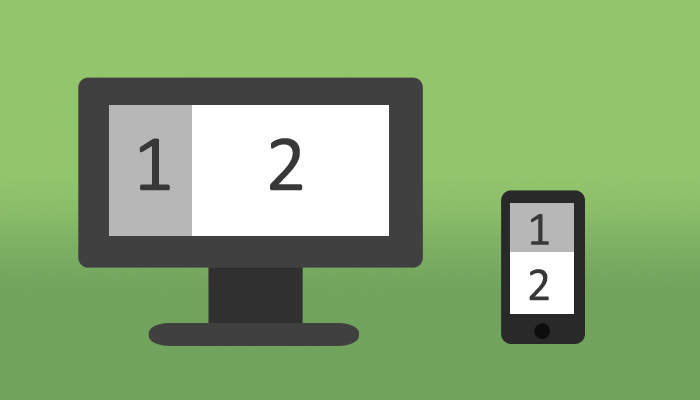
A responsive website is a website that adjusts the layout of its elements at certain screen sizes to better lay out the content on the display. To demonstrate what I mean by this, I will use the website of professional artist Adrian Göllner, which I made a few months ago. I invite you to visit the art page of his website using a modern browser (not an old version of Internet Explorer, anyway) and try resizing the browser window. A few things happen:

- The title and menu font size gets smaller, letting the menu use up less horizontal space.
- The menu sidebar collapses into a dropdown menu. This not only conserves horizontal space, but it also is very beneficial for a touchscreen interface. It is not easy to select an item in a series of close-together links on a touchscreen because the area you select with the tip of your finger could easily be about 40 pixels in diameter. However, when presented with a dropdown menu, smartphones generally provide a modal window with large, easy-to-press buttons for each option. It saves you work and saves the user frustration. Win-win!
- The icons readjust their positions to fit less in each row. No scroll bars are needed. Likewise, when the page is resized to a larger scale, more icons are placed in each row, if there are any more. It takes advantage of the space given to it.
Because of these incremental changes in layout, the website works just as well on phones and tablets as it does on desktops. This is what responsive web design is about.
Pre-emptively fix bugs
The first thing you'll want to do is add this little code snippet into the <head> section of your HTML so that smartphone web browsers don't try to auto-size webpages:
<meta name="viewport" content="width=device-width, initial-scale=1.0">Also, Internet Explorer versions 8 and lower do not natively support CSS media queries, a technique I will explain later, so we need to include a javascript file to add the missing functionality:
<!--[if lt IE 9]>
	<script src="http://css3-mediaqueries-js.googlecode.com/svn/trunk/css3-mediaqueries.js"></script>
<![endif]-->
Now we can get to work. There are many ways to add responsiveness into a design, so I will explain a bit about a few of them.
1. Elastic images
Many websites that are prepared to be resized have images that automatically fill the full width of the screen while keeping its proportions. to see an example of this, take a look at this page on Adrian Göllner's website. When you resize the screen, you'll see that the pictures stretch larger or smaller to reach the edges, except when they are stretched to a point where they stop growing because they would get to pixelated. This is really easy to accomplish.
Let's say you have an image with the class "stretchy":
<img src="my_image.jpg" class="stretchy" />Now, here's the CSS that makes it work:
img.stretchy {
	display:block;
	margin:0 auto 0 auto;
	max-width:100%;
}
The display:block and margin lines are used to center the image. The part that does the majority of the work is the max-width property. By setting max-width to 100%, we are saying that the image will not stretch to larger than 100% of its original width, but that is will shrink to less than 100% of its original width in order to fit itself into its parent element nicely. I should mention that this property does not work in Internet Explorer 6 and earlier, but at this point in time, I think it is okay to let IE6 see a non-resizing image since we can almost guarantee no one visiting your site will be using IE6's rendering engine on their phone or tablet.
2. CSS3 Media Queries
This technique is not so much a technique as it is a tool that can be used for a broad range of other techniques. Basically, it lets you apply CSS to certain ranges of screen sizes. Take the following code as an example. Here is the HTML:
<div id="sidebar">Duis sagittis suscipit lorem vitae dapibus. Phasellus et diam urna. Suspendisse placerat lectus sed arcu posuere sodales. Praesent vitae velit.</div>
<div id="main">Lorem ipsum dolor sit amet, consectetur adipiscing elit. Vestibulum tincidunt, libero in dictum aliquet, libero lectus dignissim turpis, sed scelerisque.</div>
...and here's its CSS:
#sidebar {
	background-color:#555;
	float:left;
	color:#FFF;
	width:300px;
	margin:0;
}
#main {
	background-color:#EEE;
	color:#000;
	margin:0 0 0 300px;
}
@media all and (max-width: 900px) {
	#sidebar {
		float:none;
		width:auto;
	}
	#main {
		margin:0;
	}
}
This code creates two columns that are next to each other when the browser window is wider than 900 pixels. The styling inside the @media section is not applied. However, once the screen resized to less than 900px wide (as declared in the media query), the additional styling is applied, and the columns shift so they are on top of each other, allowing each one of them to have more horizontal space than if they were next to each other.
Let's examine the parts of a media query. The first part is the media type. In the example above, the media type I used was "all", but you can narrow it down further easily. Some other useful media types are handheld, print, projection, tv, and screen, which all target their respective devices and form factors only.
The next part is where the magic happens. By adding the "and", we can restrict the query further to a specific range of widths. (max-width: 900px) applies to elements when the screen is between 0 and 900 pixels wide. You can even specify a minimum, too, so you can get a range, like so:
@media all and (max-width: 1280px) and (min-width:800px) {You can also add (orientation: landscape) or (orientation: portrait) if you want to be even more specific in your query. It's up to you when so much is possible with such a powerful tool.
The Process
There seems to be a big debate online regarding how one should begin the process of designing a responsive website. Should we start from the mobile site and work up? Do we start at the desktop and move down? Do we plan out all the designs first and make them all at once?
Personally, I have found that the way that works best for me is a combination of those. I make a plan of what the desktop design should look like first, because the majority of the traffic to my site comes from the desktop and it makes sense to cater to the target audience primarily. Then, I have a general idea of how I want the elements to behave on a smaller screen so that once I have the desktop design done I can work towards mobile with a sense of direction but with lots of experimentation.
In the end, though, it really depends on your priorities and what works for you. If you have the patience to plan out all your designs beforehand, that might be a good way to go. Or if you're making a webapp, maybe you should start with mobile and work up to ensure that users are not frustrated when accessing the app from their phones. Like I said, it depends. Responsive design is a concept, and what you choose to do with is up to you.
</dave>