Tall Tales: Tangent-Aligned Text Stretching
You've probably seen examples of graphic design with tastefully stretched text in it. It's a great effect, adding personality to the typography, and making good use of space.

A cool Japanese poster for 4K digital remaster of The Fall
It's a little tricky to pull off, though! A general rule of graphic design is that you shouldn't be stretching your text unless you know what you're doing (rules are meant to be broken, after all.) The easiest approach, simply stretching a whole block of text vertically and horizontally to fill a target area, can lead to its thoughtful curve tapering becoming offbalance, and doesn't look great more often than not.
#/media/File:Charli_XCX_-_Brat_(album_cover).png)
So what is actually going on when it's executed well? The most important thing is that only some parts of the text stretch while others stay as-is.
This is generally done by hand, but I'm interested in seeing if I can build up a reusable technique. It would be cool if I could take any font, and get a stretchable version. The question then becomes, can we define algorithmically what parts are stretchable?
Background
This sounded to me a little like a feature introduced in Flash 8 called 9-slice scaling. This was useful for creating reusable components that could fit different sizes without a similar sort of unwanted distortion as we saw in text. Basically: you slice a graphic into three parts vertically and three parts horizontally. In each axis, the first and last chunks don't stretch, and the middle one does. This lets you preserve things like rounded corners when scaling.
This also sounds a bit like the CSS flexbox model. In a flex container, you can assign a flex number to each child (let's call it \(f_i\)) representing what proportion of the stretch the child is allowed to take on. Item \(i\) ends up gaining the fraction \(\frac{f_i}{\sum_{n} f_n}\) of the additional size left over in the container. This means that if all items have a value of 1, they fill the space evenly. If one has a value of 1 and the other has a value of 2, one gets a third of the space and the other gets two thirds. A child with a value of 0 does not stretch at all. The three chunks in one axis of 9-slice scaling can be described as having the values 0, 1, and 0. So you can think of 9-slice scaling as like a special case of flexbox where all the cells have a flex of 1 or 0, and in a specific pattern. But flexbox has freedom to do more!
So for text, I kind of want different layouts of the slices for different letters. For the capital letter T, in each axis, I basically want the beams to not change thickness, leading to slices like this:
This looks pretty good, although also there are some kinks that are introduced along the curved serifs of the T. And you know me, I can't have any of those kinks. It gets a little smoother if we make a lot more slices, and gradually ease the flex value rather than having a sudden shift.
So that's starting to look smoother, but still not quite there. We started at 9-slice scaling, and we've done more slices... maybe what we need is \(\lim_{n \rightarrow \infty} n\)-slice scaling, where we can have a truly smooth transition?
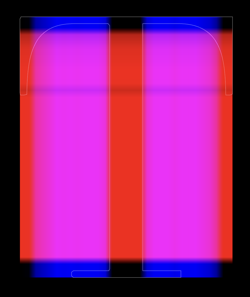
The red channel represents the stretchiness vertically, and the blue channel represents the stretchiness horizontally.
If we're going to do it this way, that's... let me see... \(\infty\) different slice weights I'll have to define. Aint got time for that. So we'll need a way to generate the weights automatically.
To stretch, or not to stretch
We're going to define a flex amount for each column \(x\) and each row \(y\) describing how horizontally and vertically stretchy that column and row should be. This means we'll be working one line at a time. At a high level, I'm looking for:
- A value of 0 when some part of the letter intersecting with the line is moving perpendicular to the stretch direction, so it doesn't get stretched
- A value of 1 when all the parts of the letter intersecting with the line are moving parallel to the stretch direction, so it does get stretched
- A value of 1 when there are no intersections at all. Nothing to get distorted by stretching!

The stretch and font directions are parallel, so it has a value of 1.

The stretch and font directions are perpendicular, so it has a value of 0.

Although some font directions are parallel, as long as any are perpendicular, the strip shouldn't stretch, and it gets a flex value of 0.

When parts of the font direction are in between perpendicular and parallel, the flex value should be something between 0 and 1.
For a point \(x\), let's call the tangent at that point \(\tau(x)\), and the stretch direction \(s\). An easy way to see how aligned \(\tau\) and \(s\) are is to take the dot product between them, \(\tau(x) \cdot s\). Two identical unit vectors will have a dot product of 1, two facing totally opposite directions have a value of -1, and perpendicular ones have a value of 0. We don't care about the difference between moving left and moving right (both are horizontal!), so we can take the absolute value, \(|\tau(x) \cdot s|\), and we've got a number between 0 and 1.
For values between 0 and 1, we'll want some control over the magnitude of the flex value to give us control over what should count as stretchy. A quick way to do that is to add a power \(k\) into the mix: \(|\tau(x) \cdot s|^k\). For numbers between 0 and 1, raising them to a power has the effect of bringing them closer to zero.
The zeroed out strips of a letter won't stretch as much, so it redistributes the weight just to the remaining strips. So the lower \(k\) is, the more evenly distributed the stretch (closer to simple uniform stretching), and the higher \(k\) is, the more the stretch will be concentrated to just the most direction-aligned parts of the letter.
Since we want to stretch as much as the least stretchy part of the font for a given slice, that means we'll have to take the minimum flex value across the slice. If you've got a letter glyph \(G\), and a slice line \(L\), we have to look at all the parts of the line that are inside of the glyph, \(L \cap S\), and take the minimum flex value for every point in the intersecting regions. And if there are no intersections, then we'll default that strip to being maximum stretchy.
Putting that all together, for a slice line \(L\) across the bounding box of a letter glyph \(G\), the flex value is:
\(f(L; G, s, k) = \begin{cases}1,&L \cap S = \emptyset\\\displaystyle\min_{x \in L \cap S}\left|\tau(x) \cdot s\right|^{k},&\text{otherwise}\end{cases}\)
Finding tangents
I skimmed over a sneakily annoying question we need to answer. What direction is a part of the shape "moving" in? You'd think you could just take the tangent of the curve of the font, but although it looks like a glyph is just a line drawn with some thickness, fonts (generally) are not actually represented that way.
A signed distance function (SDF) for a glyph would let you take the tangent along the current isoline, whichever one your point is on. That would work, but there just aren't that many SDF fonts. You can convert a regular font to an SDF, but that's a whole active area of research, and it's a generally heavier operation.
Most fonts you encounter are actually represented by the outline of the shape. So for some point inside the shape, it's not immediately clear what line you're on, you're just somewhere between an inside and outside. Can we come up with a relatively light way to get a tangent for any spot inside the outline? If you can, then you can grab just about any font file you'd use in other software, which would be great! Almost 2000 stretchy fonts all at once from Google Fonts alone!
I ended up constructing a \(k\)-d tree out of a number of sample points on the boundaries of the glyph. Each of these samples, being on a curve, has a well-defined tangent. Then, for any point inside the shape, I can find the closest sample point in the tree, and use its tangent. Works well enough, and doesn't make my browser lag!
Results
This works pretty much how you'd expect for a letter like T!
For round letters, at the middle of each side, there's generally a stretch-aligned part. The higher the \(k\), the more this starts to resemble 9-slice scaling, stretching out that middle bit only and keeping the corners intact.
For letters without any fully tangent-aligned segments, you end up with every slice being equally misaligned, all getting basically the same flex value. When this happens, the space is distributed evenly throughout the slices, and you get a result that looks the same as uniform stretching.
Because this works on outline fonts, you can drop in basically any font and it'll do something reasonable! Here are a few Google Fonts to try out.
Here's a more full version where you can play around with the text, fonts, weights, and more!
Future work
There are a few implementation-specific things that could be smoothed out a little still.
- My implementation is sample-based, and sometimes my slices don't quite align with the cusps on the font, leading to slight visual jank around those points. One could crank up the sample count a lot, but there's probably something smarter you could do.
- Similarly, the very first/last slice in a direction often has a flex value of 0 because the outline is perpendicular to the stretch direction. But then the next slice may be aligned. Because of this, when stretched, there's a slight bend at the very edge. Better sampling could probably remove that.
- I was a little lazy with my intersection calculation. Some fonts cross over themselves multiple times when drawing a shape. Those internal overlapping bits are not visible in a filled glyph, but their tangents do mess up this algorithm (try using a W in Playfair Display.)
- Despite being known as a Shader Guy™, I've implemented this all in JavaScript. One could probably calculate the slices in parallel in a shader if you've got the patience to pack curve or sample info into a texture to be read in the shader!
Algorithmically, some other things that would be cool to try on top of this:
- The stretch, currently, is entirely bounding box based. In theory this could also work if you stretch to a non-rectangular size if you do it one row or column at a time!
- Could you generalize this further to not be slice-based? Instead of taking the minimum across a slice, could you nonuniformly warp the shape so that you can give every \(dx dy\) fragment its own flex value?
If anyone wants to try something out, feel free to branch off of my code. It's open source on OpenProcessing if you'd like to fork the sketch and mess around!